Above all else, it is important for any design student at KABK to have a lot of fonts. It is not sufficient to have a select few high quality and versatile typefaces to rely on, rather one must cultivate an extremely large collection of gimmicky fonts that are so in-your-face with their design, that even a typographic novice will look at them and think “wow, something is weird about those letters.”
This is truly a quantity above quality pursuit. Therefore this list should not be seen as a definitive list of typefaces to understand and use, rather it’s ten new fonts to add to your growing collection. The best thing you could do is find more lists like this one and download all those fonts too.
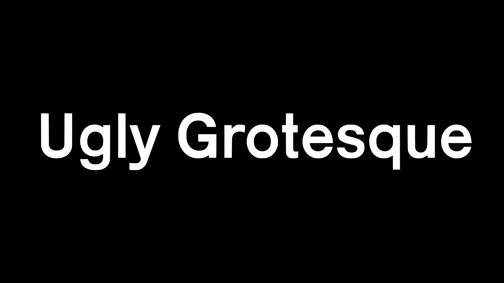
We all know that Helvetica is highly regarded as one of, if not the best, fonts in existence. The no nonsense neo grotesque has stood the test of time as one of the most versatile fonts that looks good in print and on digital mediums. It would be hard to misuse this font, which is exactly why it should be avoided. Also Rob seems to think using Helvetica is a cardinal sin and he’s basically a type god. That’s why you need some kind of Helvetica knock-off that looks ugly. This font looks like a type novice tried to recreate Helvetica from memory using software he/she doesn’t quite understand yet. The general vibe is still there, but the lowercase “t” goes up to the uppercase height and the terminals pinch in wonkey ways.
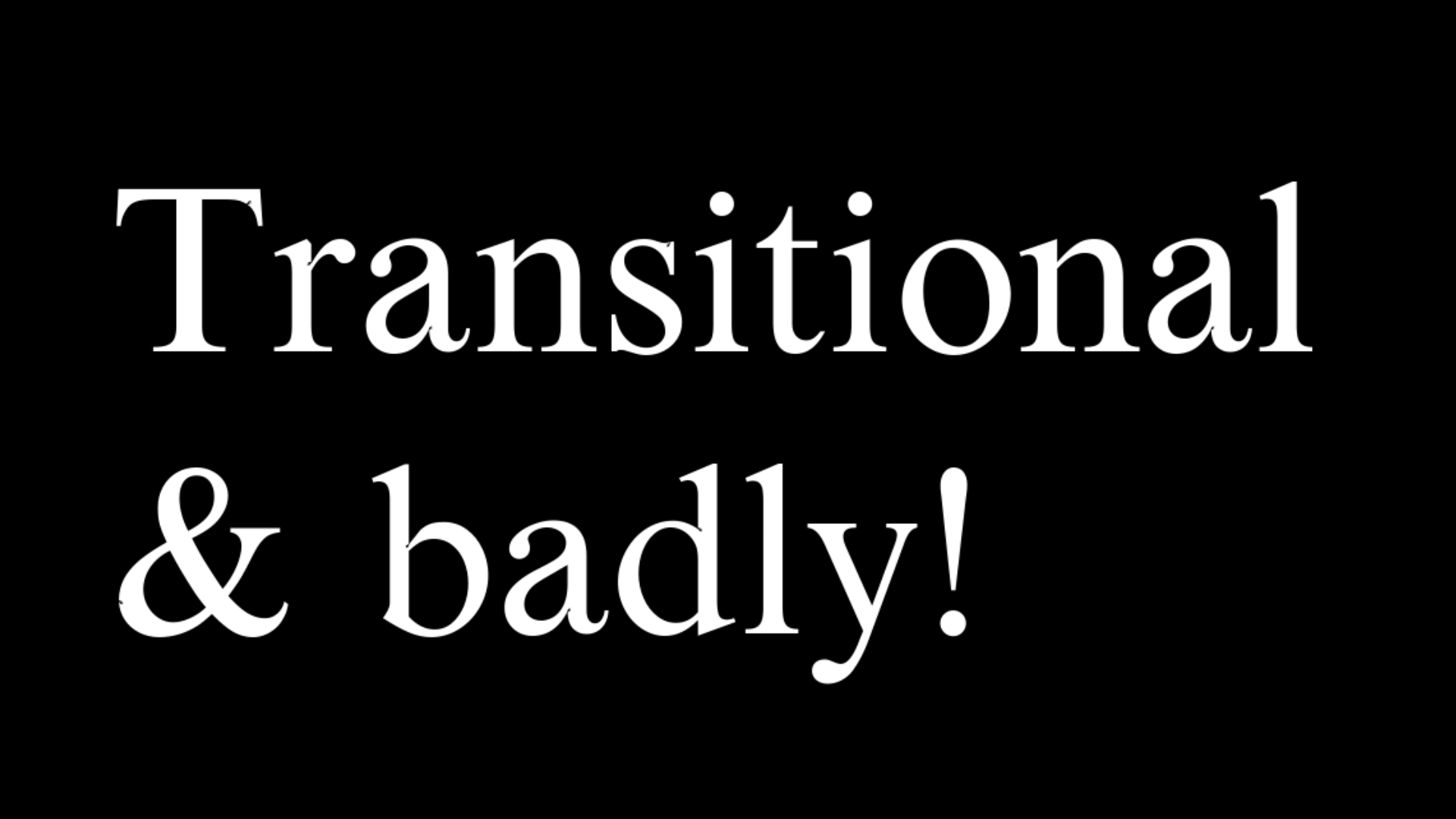
Times New Roman may not be held in quite as high esteem as Helvetica, but when it comes to unremarkable serifs, nothing quite competes with it. It says to the world “I don’t want to be making any statements with my choice of font. I just want you to read what I have to say.” Of course if you go to KABK you may find yourself in a situation where you don’t really want to be making any statements with your choice of typography, but we all know someone will have a cow if you use Times New Roman. That’s where this font comes in handy. It’s like Times New Roman, but with just enough whacky and ugly design decisions to fly under the KABK font police’s radar. “What’s this? Is it Times New Roman? Oh no wait there’s a ridiculous looking ‘ea’ ligature and the uppercase ‘S’ is upside down. I guess it’s cool enough to belong in our school.”
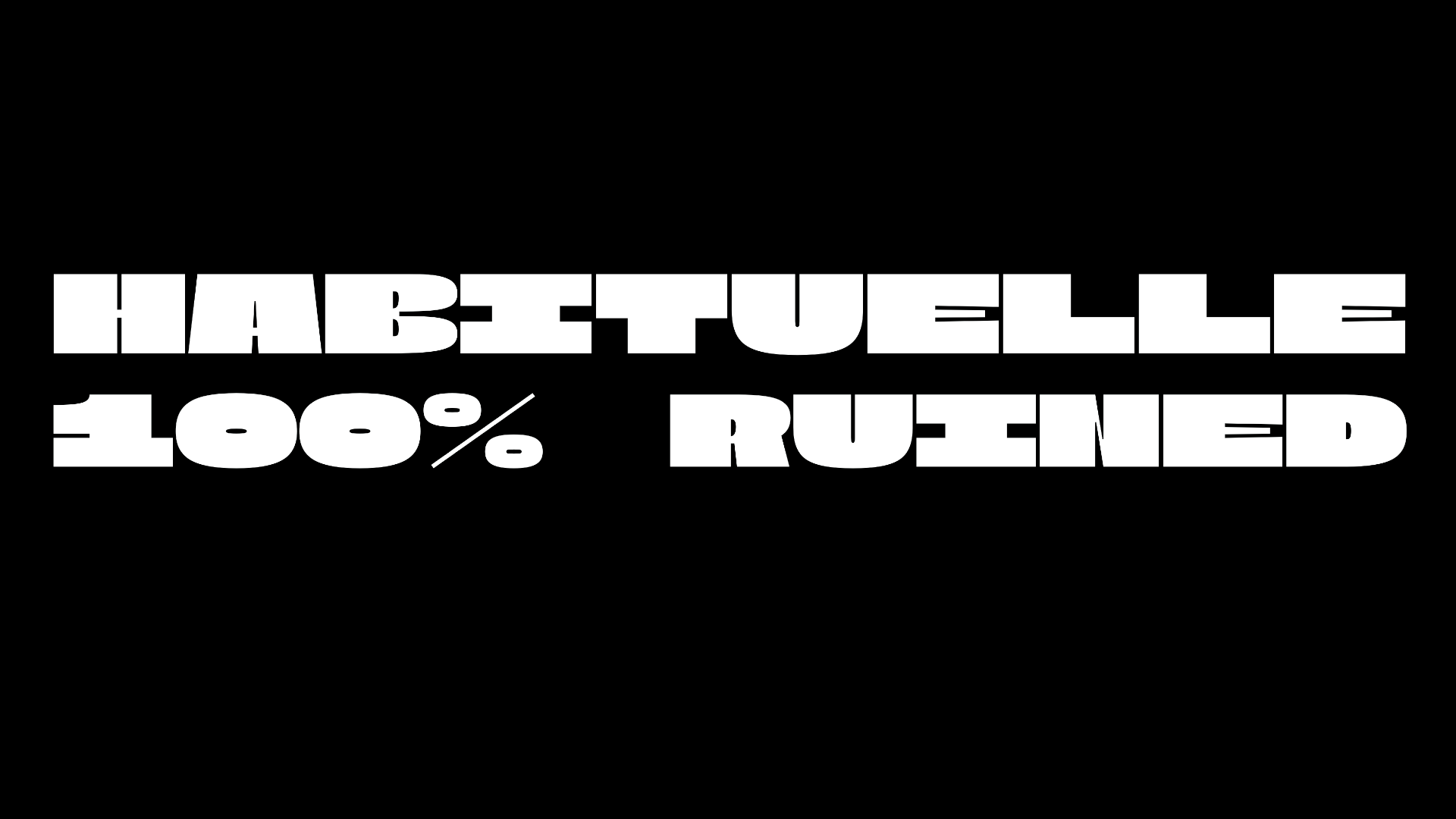
It’s very important to be bold and to make bold decisions. That’s why you need a bold looking font, and nothing says bold quite like bold. However it’s illegal in the Netherlands to just use a normal looking bold weight of a normal looking font. You will get deported to switzerland. Instead, use some kind of high contrast letters with itty-bitty strokes in the “E”s and “N”s. That way the font will only be legible at very large sizes, which is perfect because if you're designing a poster you don’t have to think of anything else to add. The font will have to be so big it takes up the whole page.
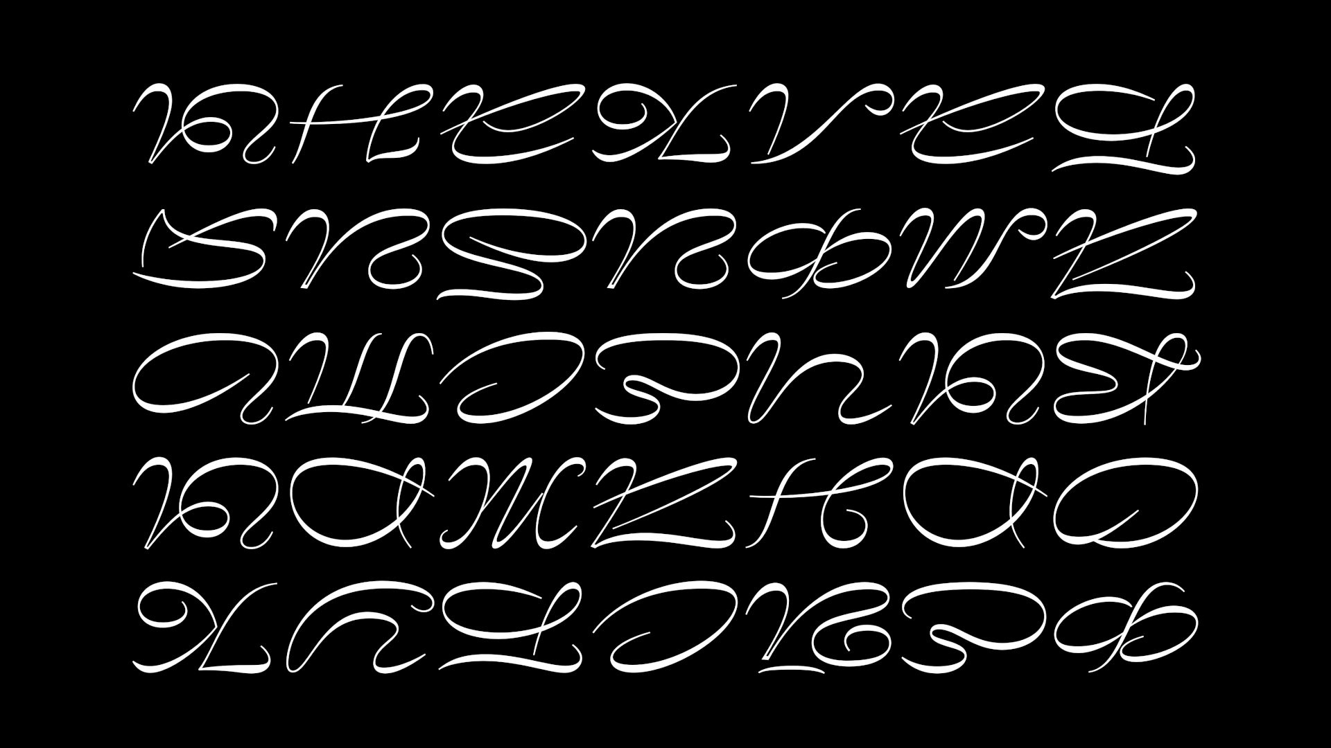
Normally we think of script fonts as being elegant, refined, dignified. Like something you’d expect on wedding invitations. We have no patience for that here. If you're going to use a script font it’s got to be ugly with weird curves and preferably a reverse contrast stroke. The shapes should be as directionless and indecipherable as tire tracks left by a 16 year old operating a car for the very first time. The shapes should be so abstractly related to whatever letter they are meant to represent as to only be recognizable in the 0.3 seconds it takes for them to appear on screen after typing before you type the next letter. The letters should look like aliens mistook snakes having sex as human letters and tried to recreat them using only low-rez photographs as refernces. People should have an easier time reading words written by a blind-folded child using their non-dominant foot to write.
You are a student, and despite the ever increasing plethora of high quality free or inexpensive fonts available to anyone with an internet connection, you are justified in stealing fonts. Students shouldn’t have to pay for fonts, nor should they have to have any awareness whatsoever about the origins of the fonts on their computer. The point is to have a lot, not to know a lot. Anyway, it’s not like type designers are real people that might actually work at the school you go to, and if they didn’t want their font to be used they shouldn’t have put it out there in the first place.
No one will take you seriously as someone who lays out books unless your page numbers are neon purple and take up half the page. How else will people know what page they're on? No one will take you seriously as a font connoisseur either unless you find a typeface that has all of the coolest techniques all at once. Inktraps? Swashes? Tight Shoulders? Flailed Leg Terminals? Beaks on the “S”? Bilateral Reflexive Optical Inversions on the Arm Apex? You may not understand what all this type jargon means, but the designer sure does because his website has 14 paragraphs with annotations explaining why this font is superior to all the pathetic typefaces that don’t even have bracketless bowl nibs. A less refined eye might look at the curvy four and think it’s tacky, but you know it's the mark of a type designer with taste and education. And by proximity you are tasteful and educated.
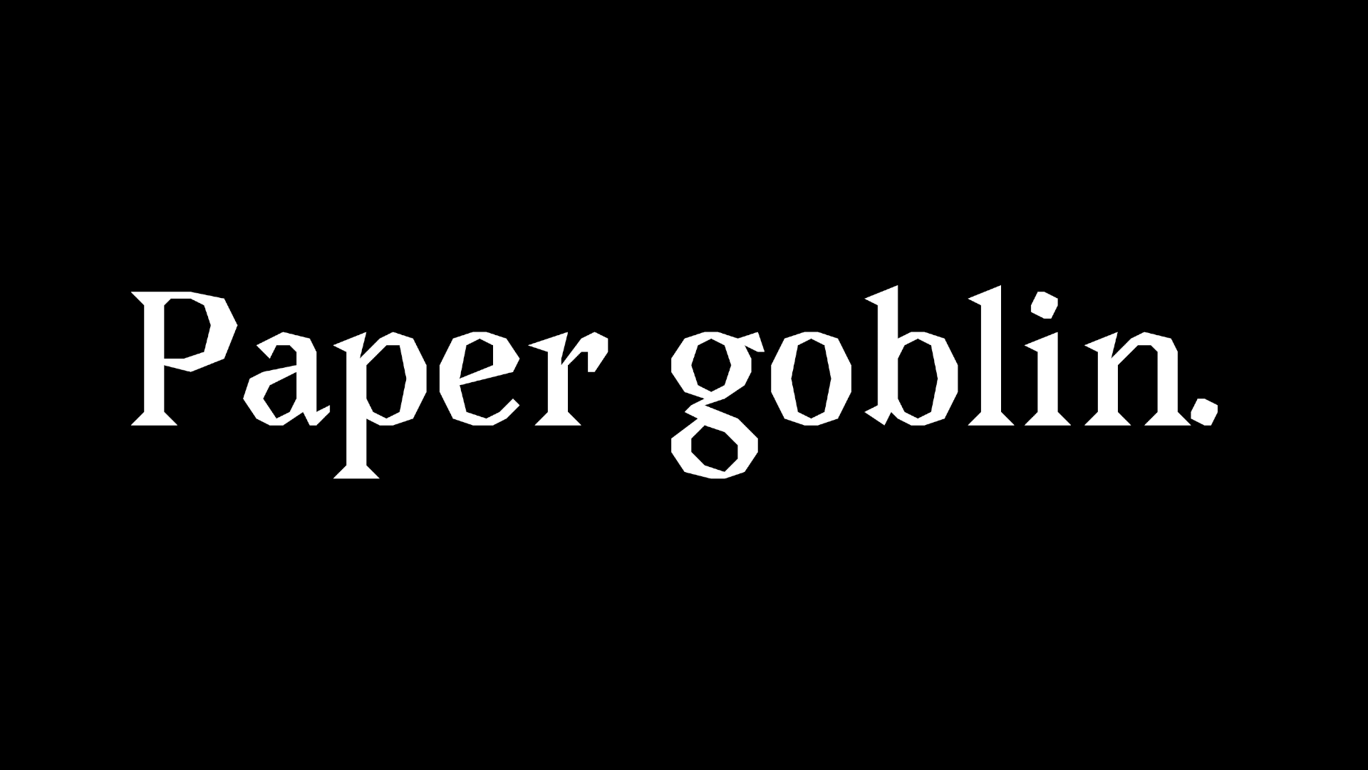
Sometimes you’ll need something to stand out as dark, mysterious, edgy, or foreboding. Like if you’re doing a layout about human rights abuses in some far away third-world country such as the US, or you’re making a pamphlet about victorian bloodletting where you’ve removed so much of the text that readers will walk away wondering why you made a list of vampire romance novel titles with pictures of sickly children. You’ve already limited your color pallet to black and white and red (the most mysterious, edgy, and foreboding of the color pallets) but you need a font to match. That’s where the jagged edge serif comes in. The font screams “I’ve seen a knife before and I’m a designer.” The font screams “I saw a movie poster for a victorian train murder mystery but decided not to see it because the director wasn’t Wes Anderson, Quentin Tarantino, or French.” The font screams. It looks especially stupid in italic.
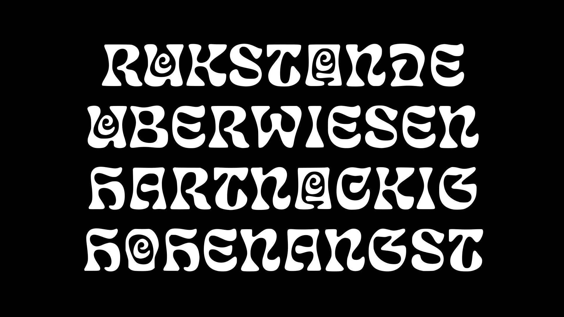
We are a very liberated people here in this country. We live in an evolved society. Here drugs and prostitution are legal, and people feel free to do as they please. Nothing says freedom and open mindedness quite like psychedelic design aesthetics. The hippies and their free love and drugs and the music. Of course no one holds hands in public or expresses any physical affection, the police regularly show up in the hundreds with guns and armored vehicles, and a single red pepper flake will send any dutchie to the nearest hospital, but this isn’t because we’re repressed, it’s just the best way to be as a society. And what better way to capture this through design then with a psychedelic font that somehow manages to feel cold, mechanistic, and heartless? Letters are swooping and curvy and bubbly. They have all the markings of classics like Copper Black, and yet somehow there is a perceptible regularity and rigidity to the letters. Like the designer feels compelled to act liberated but has a deep seeded fear of doing so wrong.
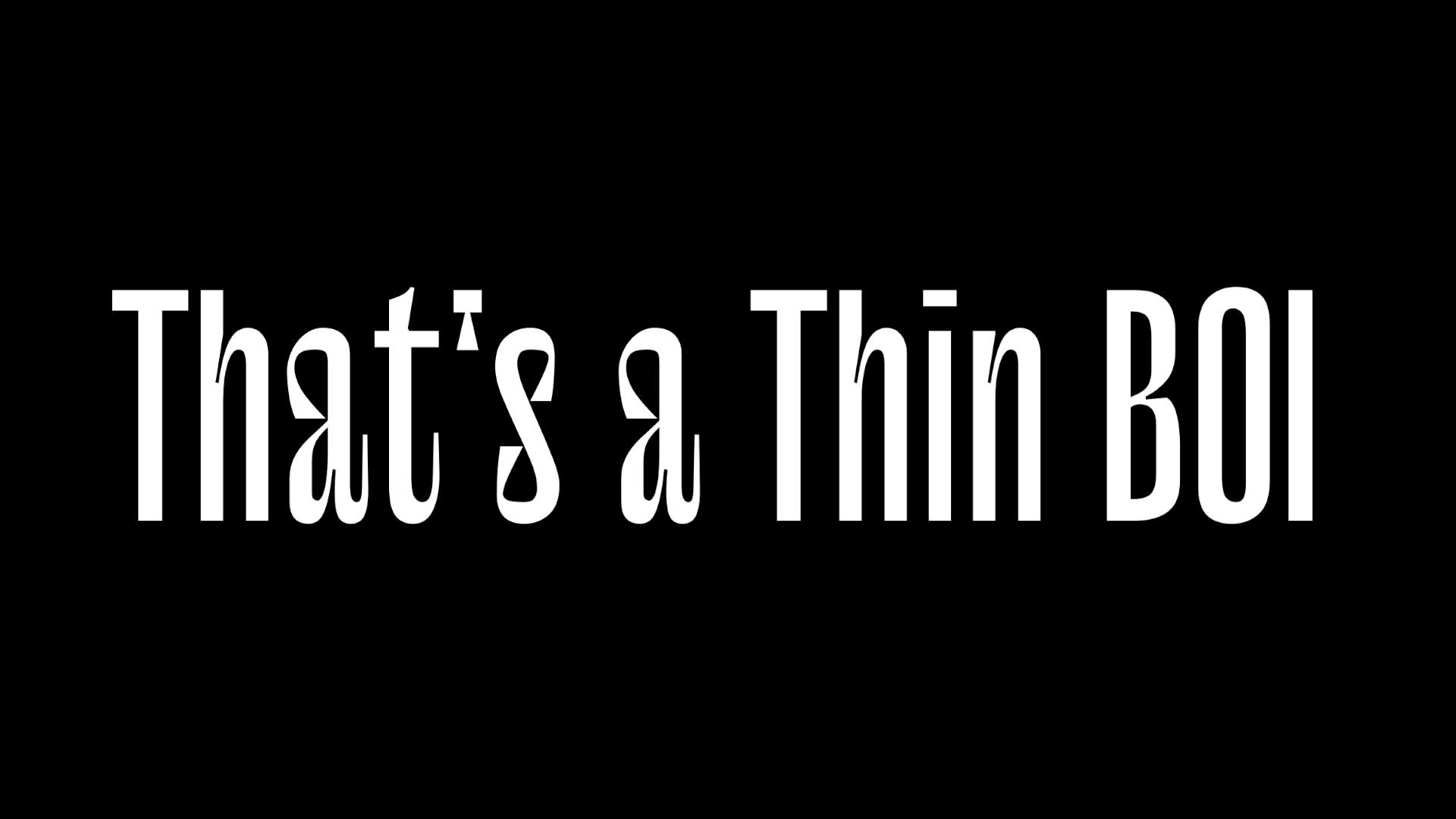
Wow! These letters sure are thin! Look at them, all smoshed together like that. If they were any more condensed the text would look like a barcode. What an amazing accomplishment on the designers part. Managing to make letters that are so tall. On their own they look like a single gust of wind could send it toppeling, but together? I can tell this is all part of the same typeface because the letters are all so thin. Sure if you were to redraw these letters at a normal width they’d look like an incohesive mess with so many arbitrary design decisions it’s as if the typeface designer had a client that threw out the first 20 ideas for each letter on nothing more than principal, but all squished like that? So elegant and refined. Be sure to check this one out as a serif as well.
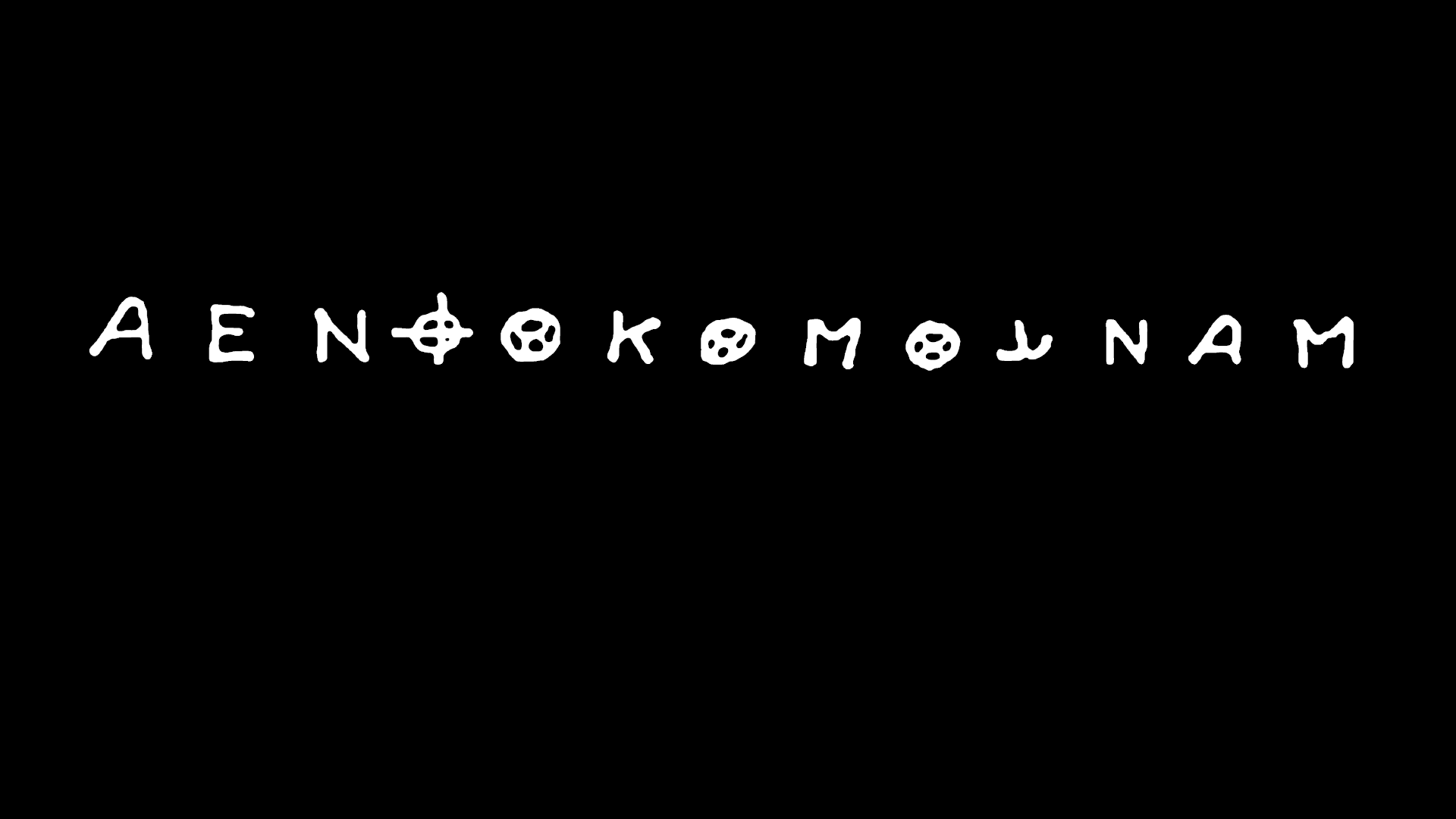
Violence to you is largely hypothetical. Unfortunately, violence is the spice of life, and happy sain individuals do not make interesting designers. That’s why we must look to those less fortunate than us (at a safe distance) for design inspiration. Emulating the style and aesthetic of the unhinged is perfect. Because after all, we are not and could not be unhinged ourselves. No no no. These letters are spicy, fun! Show the world you’re not just vanilla and docile with deranged serial killer letters! Make posters that look like ransom notes!